Most developers reach for Google Analytics without thinking. It's free, it's everywhere, and you already have an account. But you're running Rails -- you have a database, a server, and a framework that's very good at building things. Why hand your visitors' data to Google when you can own every line of the analytics code yourself?
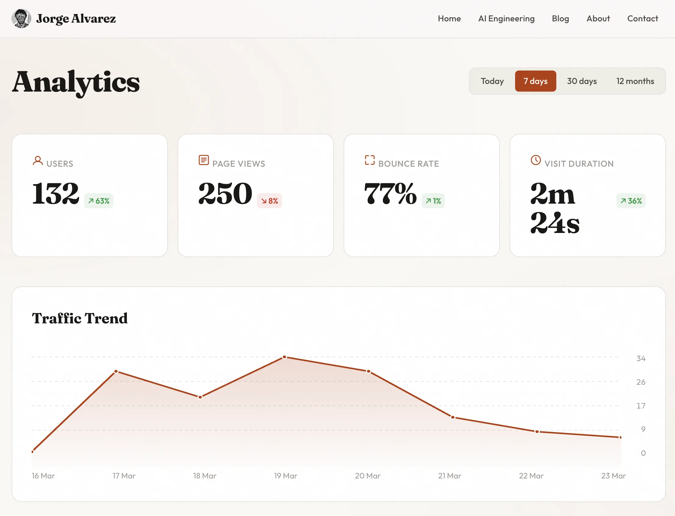
I built a full analytics dashboard for this blog: unique visitors, page views, bounce rate, visit duration, traffic trends with SVG charts, geolocation by country, referral breakdowns, period-over-period comparison. It's public -- go look at it at /analytics. Every metric, every chart, every table. No third-party scripts, no cookie banners, no data leaving my server.
Here's exactly how I built it with Claude Code as my AI pair programmer.
Why build your own analytics
Four reasons, in order of importance:
Privacy. No third-party JavaScript tracking your visitors across the web. No cookie consent banners. No GDPR headaches beyond what you'd already have. Your visitors' data stays in your database, on your server.
Ownership. When Google decides to change their dashboard, deprecate a metric, or sunset Universal Analytics (again), you're not affected. Your data, your queries, your rules.
Customization. Google Analytics shows you what Google thinks matters. I wanted to see exactly the metrics relevant to a solo blog -- top pages, referral domains classified by type (social, search, other), period comparison badges, and a clean SVG trend chart. No funnel analysis, no e-commerce tracking, no noise.
Simplicity. One gem for tracking. One controller for queries. One view for display. That's the entire analytics stack. Compare that to learning GA4's event model, tag manager, data streams, and property configuration.
The alternatives like Plausible, are good products. But they cost money, run on someone else's infrastructure, and still mean you don't own the code. For a personal blog, building it yourself takes less time than evaluating SaaS options.
The tools
Three pieces make this work:
Ahoy Matey handles page view tracking. It's a Rails gem that records visits and events server-side -- no JavaScript tracker needed, no cookies. It creates two tables (ahoy_visits and ahoy_events) and gives you ActiveRecord models to query them. Configure it to run without cookies and you get privacy-friendly tracking with zero client-side code.
Geocoder + MaxMindDB handle IP geolocation. Geocoder is the standard Ruby geocoding gem. Pair it with a local MaxMind GeoLite2-City database file and every IP lookup happens on your server -- no external API calls, no rate limits, no latency. Ahoy integrates with Geocoder automatically if you tell it to.
Claude Code + Ariadna is how I actually built it. Claude Code is Anthropic's CLI tool for AI pair programming -- you describe what you want, it reads your codebase, and writes the code. Ariadna is a Claude Code plugin that adds structured planning on top. Instead of going straight from idea to code, Ariadna introduces a workflow: write a design spec that describes what to build and why, generate an implementation plan with specific tasks, file paths, and commit messages, then execute task by task with clean atomic commits. Think of it as adding a planning layer between "I want analytics" and "here's the code."
The Ariadna workflow for the analytics dashboard looked like this:
- Design spec -- I described the dashboard I wanted: KPI cards, SVG charts, period comparison, geolocation. I specified Ahoy for tracking, no JavaScript charting libraries, public access without authentication.
- Implementation plan -- Ariadna broke the spec into ordered tasks: install and configure Ahoy, create the Trackable concern, build the analytics controller with metric calculations, build the view with SVG charts, add geolocation, write tests.
- Execution -- Claude Code followed the plan task by task. I reviewed each commit before moving to the next. If something needed adjustment, I said so and Claude Code corrected it.
The design spec was around 200 lines. The implementation plan was over 800. The resulting code was clean, tested, and shipped in one session.
Tracking page views automatically
The first thing you need is a way to record every page view without touching every controller action. A Rails concern handles this perfectly.
# app/controllers/concerns/trackable.rb
module Trackable
  extend ActiveSupport::Concern

  included do
    after_action :track_page_view
  end

  private

  def track_page_view
    return unless trackable_request?
    ahoy.track "Page View", url: request.path
  end

  def trackable_request?
    request.get? &&
      request.format.html? &&
      response.successful? &&
      !request.path.start_with?("/admin", "/login", "/session", "/up", "/mcp")
  end
end
Include this in ApplicationController and every public page request is tracked automatically. The trackable_request? method filters out the noise -- admin pages, login attempts, health checks, API endpoints. Only successful GET requests for HTML pages get recorded.
The Ahoy configuration is equally minimal:
# config/initializers/ahoy.rb
class Ahoy::Store < Ahoy::DatabaseStore
end

Ahoy.api = false
Ahoy.cookies = :none
Ahoy.server_side_visits = :when_needed
Ahoy.visit_duration = 30.minutes
Three lines that matter: api: false disables the JavaScript API (we don't need it), cookies: :none means no cookies are set on the visitor's browser, and server_side_visits: :when_needed creates visit records on the server side. Zero JavaScript. Zero cookies. Every page view is tracked by a single after_action callback.
The analytics controller -- computing real metrics
The analytics controller the raw Ahoy data and computes the metrics you'd expect from any analytics dashboard.
The controller starts by determining the time period and querying both the current and previous periods:
def index
  @period = params[:period] || "30d"
  @since = period_start(@period)
  @previous_since = previous_period_start(@period)

  visits = Ahoy::Visit.where("started_at >= ?", @since)
  previous_visits = Ahoy::Visit.where(
    "started_at >= ? AND started_at < ?", @previous_since, @since
  )
  events = Ahoy::Event.where("time >= ?", @since)
    .where(name: "Page View")
  # ...
end
Four periods are available: today, seven days, 30 days, and 12 months. Each one also queries the equivalent previous period for comparison. The seven-day view compares against the previous seven days, the 30-day view against the previous 30 days.
Unique visitors is straightforward -- Ahoy assigns each visitor a visitor_token based on their IP and user agent:
@unique_visitors = visits.distinct.count(:visitor_token)
Bounce rate requires grouping events by visit and counting how many visits had only one page view:
def compute_bounce_rate(events_scope)
  page_view_counts = events_scope.group(:visit_id).count
  visits_with_views = page_view_counts.size
  return 0 if visits_with_views == 0

  bounced = page_view_counts.count { |_, count| count == 1 }
  (bounced.to_f / visits_with_views * 100).round(0)
end
A bounce is a visit where the visitor saw exactly one page and left. Simple concept, but getting the query right matters. We group all page view events by visit_id, count them, and determine what percentage of visits had exactly one event.
Visit duration is trickier. You can only calculate duration for visits where the visitor viewed at least two pages -- single-page visits have no second timestamp to measure against. This uses SQLite's strftime to compute the difference in seconds between the first and last event:
def compute_avg_duration(events_scope)
  durations = events_scope
    .group(:visit_id)
    .having("COUNT(*) >= 2")
    .pluck(Arel.sql(
      "CAST(strftime('%s', MAX(time)) - strftime('%s', MIN(time)) AS INTEGER)"
    ))

  return 0 if durations.empty?
  (durations.sum / durations.size.to_f).round(0)
end
The HAVING("COUNT(*) >= 2") clause is critical. Without it, you'd include single-page visits as zero-duration entries and artificially deflate the average.
Period comparison computes the percentage change and flags whether the change is positive or negative -- with special handling for bounce rate, where a decrease is actually good:
def percentage_change(current, previous, inverted: false)
  return nil if previous == 0 && current == 0
  return :new if previous == 0

  change = ((current - previous) / previous.to_f * 100).round(0)
  { value: change, positive: inverted ? change <= 0 : change >= 0 }
end
The inverted: true flag for bounce rate means that when the bounce rate drops, the badge shows green, not red. Small detail, but it avoids confusing yourself every time you check the dashboard.
The helper methods that display these metrics in the view are equally direct:
# app/helpers/analytics_helper.rb
module AnalyticsHelper
  def format_duration(seconds)
    seconds = seconds.to_i
    return "0s" if seconds <= 0

    hours = seconds / 3600
    minutes = (seconds % 3600) / 60
    secs = seconds % 60

    parts = []
    parts << "#{hours}h" if hours > 0
    parts << "#{minutes}m" if minutes > 0
    parts << "#{secs}s" if secs > 0 || parts.empty?
    parts.join(" ")
  end

  def change_badge(change)
    return "" if change.nil?

    if change == :new
      tag.span("New", class: "analytics-kpi-change analytics-kpi-change--new")
    else
      css = change[:positive] ? "analytics-kpi-change--up" : "analytics-kpi-change--down"
      arrow = change[:positive] ? "↗" : "↘"
      tag.span("#{arrow} #{change[:value].abs}%",
        class: "analytics-kpi-change #{css}")
    end
  end
end
format_duration converts seconds into a human-readable string -- "2m 30s" instead of "150." change_badge renders the comparison indicator with an arrow and color.
Visualizations with pure SVG
I made a deliberate choice here: no Chart.js, no D3, no JavaScript charting library. The traffic trend chart is rendered entirely in ERB and SVG. One less dependency, works without JavaScript, and the code is surprisingly simple.
The view calculates SVG coordinates from the data and draws a polyline with a gradient fill:
<%
  points = @trend_data.to_a
  max_val = points.map(&:last).max.to_f
  max_val = 1.0 if max_val == 0
  chart_w = 800
  chart_h = 200
  usable_w = chart_w
  usable_h = chart_h - 40  # padding

  coords = points.each_with_index.map do |(_, val), i|
    x = i * (usable_w.to_f / (points.size - 1))
    y = 20 + usable_h - (val / max_val * usable_h)
    [x.round(1), y.round(1)]
  end

  polyline = coords.map { |x, y| "#{x},#{y}" }.join(" ")
  area = "#{coords.first[0]},#{chart_h} #{polyline} #{coords.last[0]},#{chart_h}"
%>

<svg viewBox="0 0 800 200" preserveAspectRatio="none">
  <polygon points="<%= area %>" fill="url(#areaGradient)" />
  <polyline points="<%= polyline %>" fill="none"
    stroke="var(--accent)" stroke-width="2.5"
    stroke-linejoin="round" stroke-linecap="round" />
  <% coords.each do |x, y| %>
    <circle cx="<%= x %>" cy="<%= y %>" r="3"
      fill="var(--accent)" stroke="var(--surface)" stroke-width="1.5" />
  <% end %>
  <defs>
    <linearGradient id="areaGradient" x1="0" y1="0" x2="0" y2="1">
      <stop offset="0%" stop-color="var(--accent)" stop-opacity="0.2" />
      <stop offset="100%" stop-color="var(--accent)" stop-opacity="0.02" />
    </linearGradient>
  </defs>
</svg>
The math is basic: map each data point to an x,y coordinate within the SVG viewBox, join them into a polyline string, and create a polygon for the gradient fill area. Grid lines are dashed <line> elements. Data point dots are <circle> elements. The whole chart responds to CSS custom properties (var(--accent), var(--surface)), so it works with light and dark themes automatically.
For tabular data -- top pages, referrers, countries -- I use inline bar visualizations. Each row has a background bar whose width is proportional to the maximum value:
<% @top_pages.each do |page, count| %>
  <tr>
    <td>
      <div class="analytics-table-bar-cell">
        <div class="analytics-table-bar"
          style="width: <%= (count / max_page * 100).round(1) %>%">
        </div>
        <span><%= truncate(page, length: 60) %></span>
      </div>
    </td>
    <td class="analytics-table-num"><%= number_with_delimiter(count) %></td>
  </tr>
<% end %>
The bar is just a div with a percentage width and a translucent background color. The text sits on top. It gives you the visual impact of a bar chart inside a table, with no JavaScript.
Adding geolocation
Knowing which countries your visitors come from is valuable, and it doesn't require an external API. MaxMind publishes a free GeoLite2 database that maps IP addresses to countries and cities. Download the .mmdb file, drop it in your project, and configure Geocoder to use it:
# config/initializers/ahoy.rb (geolocation section)
mmdb_path = Rails.root.join("db/maxmind/GeoLite2-City.mmdb")
if mmdb_path.exist?
  Geocoder.configure(
    ip_lookup: :geoip2,
    geoip2: { file: mmdb_path }
  )
  Ahoy.geocode = true
else
  Ahoy.geocode = false
end
The conditional check means the app works without the MaxMind file -- it just skips geolocation. This matters for development environments and CI where you might not have the database file.
When Ahoy records a visit, Geocoder looks up the IP address against the local MaxMind database and populates the country field. The controller query is one line:
@top_countries = visits.where.not(country: [nil, ""])
  .group(:country).order(Arel.sql("count(*) DESC")).limit(20).count
Testing
The analytics dashboard has 11 integration tests covering the full range of functionality. The test file uses two helper methods that create Ahoy records directly:
def create_visit(visitor_token: SecureRandom.hex,
                 started_at: Time.current, **attrs)
  Ahoy::Visit.create!(
    visit_token: SecureRandom.hex,
    visitor_token: visitor_token,
    started_at: started_at,
    **attrs
  )
end

def create_event(visit:, time: Time.current, url: "/blog")
  Ahoy::Event.create!(
    visit: visit,
    name: "Page View",
    properties: { "url" => url },
    time: time
  )
end
These helpers let you set up precise test scenarios. For example, testing bounce rate:
test "calculates bounce rate from single-page visits" do
  v1 = create_visit(started_at: 1.day.ago)
  create_event(visit: v1, time: 1.day.ago)

  v2 = create_visit(started_at: 1.day.ago)
  create_event(visit: v2, time: 1.day.ago)
  create_event(visit: v2, time: 1.day.ago + 5.minutes, url: "/about")

  get analytics_url

  assert_response :success
  assert_select ".analytics-kpi-card .analytics-kpi-value", text: "50%"
end
One visit with one page view, one visit with two page views. Expected bounce rate: 50%. The test asserts the rendered HTML contains exactly that value. Other tests cover unique visitor deduplication, visit duration calculation, zero-data handling, period selection, country display, and comparison badges.
The Claude Code workflow that made this fast
This is where I want to be specific about what "AI pair programming" actually means in practice, because most descriptions stay vague.
Claude Code is a CLI tool. You run it in your terminal, it has access to your project files, and you have a conversation about what to build. It reads your code, suggests changes, writes files, runs tests. Think of it as a very capable colleague who can type fast but needs you to steer.
Ariadna is a plugin for Claude Code that adds structure. Without Ariadna, a typical Claude Code session goes: "Build me analytics." Claude Code starts writing code, you review as it goes, you course-correct when needed. This works fine for small tasks. For anything bigger, you end up with a wandering conversation and code that reflects that wandering.
With Ariadna, the workflow has explicit phases:
Design spec. You describe what you want to build, why you're building it, and the key architectural decisions. For the analytics dashboard, the spec covered: which gem to use for tracking (Ahoy), how to handle geolocation (local MaxMind file), what metrics to compute (unique visitors, bounce rate, duration, period comparison), how to render charts (pure SVG, no JavaScript libraries), and access control (public, no authentication). The spec is a document, not a conversation -- it's written to a file that becomes the source of truth for the build.
Implementation plan. Ariadna generates an ordered list of tasks from the spec. Each task specifies exactly which files to create or modify, what the code should accomplish, and a pre-written commit message. The plan for the analytics dashboard had tasks like: "Install and configure Ahoy gem with cookie-less tracking," "Create Trackable concern with smart request filtering," "Build AnalyticsController with KPI computation methods," "Add SVG chart generation to analytics view," "Configure MaxMind geolocation," and "Write integration tests." Each task included the specific file paths, the approach, and success criteria.
Execution. Claude Code follows the plan task by task. It writes the code, runs the tests, and creates a commit. You review each commit before the next task starts. If something needs adjustment -- "that bounce rate calculation is wrong" or "I want the chart to use CSS custom properties" -- you say so, Claude Code fixes it, and the commit is amended before moving on.
Making it public
Most analytics dashboards sit behind a login. I made mine public because transparent analytics builds trust. When someone reads a blog post and wonders "does anyone actually read this?" they can check for themselves.
There's no sensitive data on the page -- just aggregate metrics. Individual visitor IPs and tokens never appear in the view. The worst someone can learn from my public analytics is which pages are popular and what countries my readers are from.
What I learned
Building your own analytics dashboard takes less time than you'd expect. The Ahoy gem handles the hard parts -- visit tracking, visitor identification, event storage. What's left is a controller that runs queries and a view that renders the results.
The total footprint: an entire analytics system in under 600 lines of code (including views). Every line is readable, every query is understandable, and every metric is computed exactly the way I want it.
Using Claude Code with the Ariadna planning workflow meant the code came out clean on the first pass. The spec forced me to make architectural decisions up front -- cookie-less tracking, pure SVG charts, inverted bounce rate comparison -- instead of discovering them mid-build. The plan gave Claude Code a clear path to follow, which meant fewer course corrections and more time reviewing code instead of writing prompts.
The stack is simple: Rails + Ahoy + Geocoder + MaxMind + CSS custom properties + ERB. No JavaScript analytics library, no charting framework, no external tracking service. Everything runs on the same server that runs the blog.
Check out my analytics at alvareznavarro.es/analytics. Then build your own. If you're running Rails, you already have everything you need.